


The obsession with the crest (and all the other bits) in higher education logos
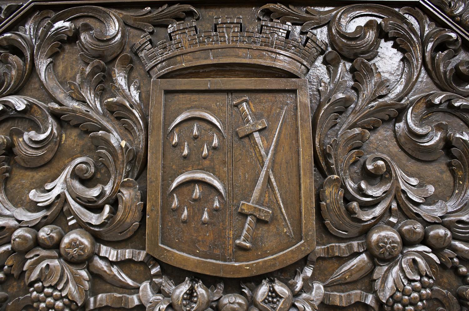
Books, mortar boards, the Southern cross, the sun, stars, angels, lions, black swans, crosses, swords, castles, ships, water, floral elements, graphical flourishes, Latin mottos. All housed in or around a crest.
In the QS World University Rankings 2011/2012, of the top 20 global institutions, nine used crests (this included the first and second placed universities), nine didn’t use crests and two were too close to call. In the Australian University National Rankings (of the 2011/2012 The Times Higher Education World University Rankings), twelve used crests (this included the top seven universities), seven didn’t and one was a bit of both.
So what does all that mean? Well, it actually seems like an even split between global universities who use/don’t use crests. But maybe the interesting bit is the top seven Australian universities use crests.
Does that suggest the market place has become a bit over crowded with the traditional looking logo? It could be argued that because the top seven universities use a crest, it must be the right thing to do? But, on face value, does that make all those universities look the same? Should universities be striving to differentiate themselves from their competitors? Aren’t they wanting to be seen as ‘individual’ by their target audience? Should this apply to the logo too?
As universities start to look further afield for new opportunities, it is generally accepted that if no emotional relationship is formed with potential customers, no purchase will be made. Whether it’s targeting the next intake of students (possibly from overseas) or to attract new investment, one thing is certain – every university is doing the same thing. Its brand will therefore be on show and that is headed by the logo.
Tradition is a big part of a distinguished university. Yes, no arguments there. Is there a place for its history? Absolutely, it shouldn’t be forgotten, it’s a huge part of how the institution came into existence. Are the universities still viewed as ‘traditional places of education’? No, that bit seems to be changing. Like everything else, they are evolving, mainly due to their students needs. Just look at the impact of technology and social media on how teaching is being delivered to students.
Let’s tackle this from another angle. Banks – some of the safest places on the planet. Many have strong historical connections and were viewed as being conservative, formal and dignified. If most of the largest banks had similar logos, they would then have to work very hard to differentiate their products. The oldest bank in Australia (in its original guise) is older than the oldest university but it recognised and accepted that in order to continue be relevant to its customers, it had to distance itself from its competitors.
Here’s another example – a law firm. Much like the banking world, a law firm used to be thought of as very traditional, solemn, professional place with a long history. But again, they have evolved to become individual in their offerings, which has been reflected in their logos.
So, if a bank can do it and a law firm can do it, could a top university do it? If the rest of a university brand is so different from its competitors, should the logo also be different? If the higher education market is becoming increasingly crowded, should every part of the brand (including the logo) be scrutinised to check it differentiates enough from every other institution and thoroughly resonates with its target audience?
Nowadays, it isn’t about how old a university is, it’s about what it can offer its students (past, current and future). A high-ranking national university wouldn’t be over-looked if it didn’t have a crest (and all the other bits) in its logo. In fact, if it was among the top seven wouldn’t it become more visible? Isn’t that what a logo is for?
To soften the pain, could the logo be modernised or some of the content updated? Books are still part of modern teaching but maybe there’s an argument for replacing the sword for an iPhone or the ship with the Facebook icon – wouldn’t that be so much more relevant to the student of today? I jest of course!
But on a serious note, it’s worth a conversation at the very least.
Submit a Comment